Prompt was to design a fictitious album cover.
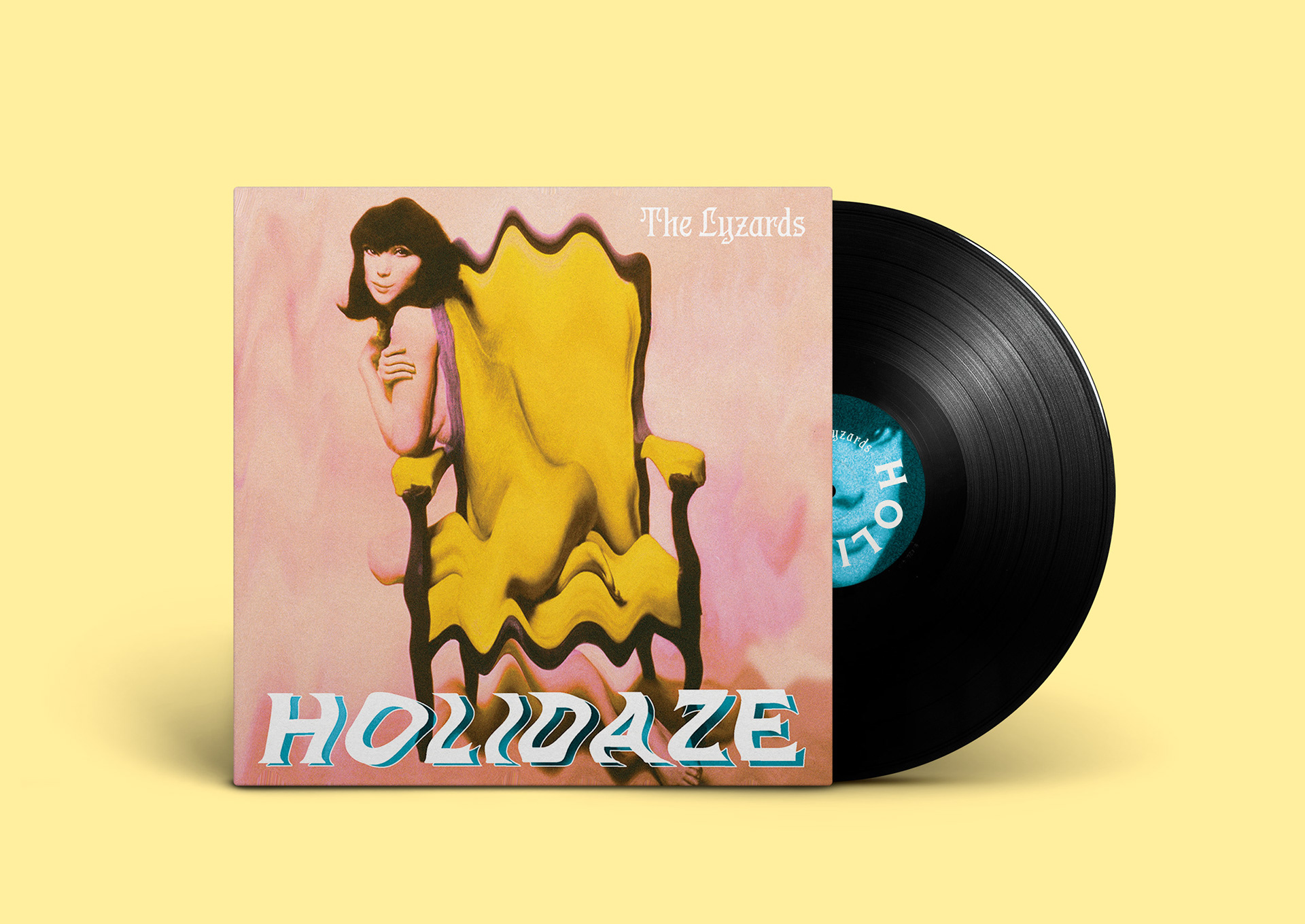
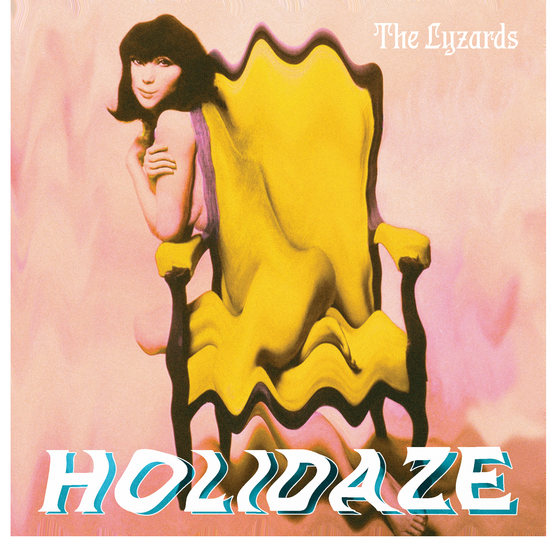
I first started thinking of the band name and genre I wanted to create. Channeling the late 60's psychedelic bands who were heavily influenced by the Beatles, I thought about how the Bryds had the “y “as an” i “and came up with The Lyzards. I started manipulating the woman in the chair image, warping it to look like a surrealist painting.Her smile twisting like a menacing Mona Lisa. I wanted to keep the spirit of the 60's but make it hip and modern. I explored several different typefaces for the album’s title. I manipulated , tried metallic and gold effects and nothing worked until I used a simple font from the same foundry as Pentz and twisted it to mimic the woman. I then experimented with the painterly effects to soften the hard edges and layered it in different ways with shadows and blending modes. I chose Pentz for the band typeface because it felt slightly medieval and 70s but not “metal” or “groovy” . Pentz was based off a Marvin Gaye album cover.